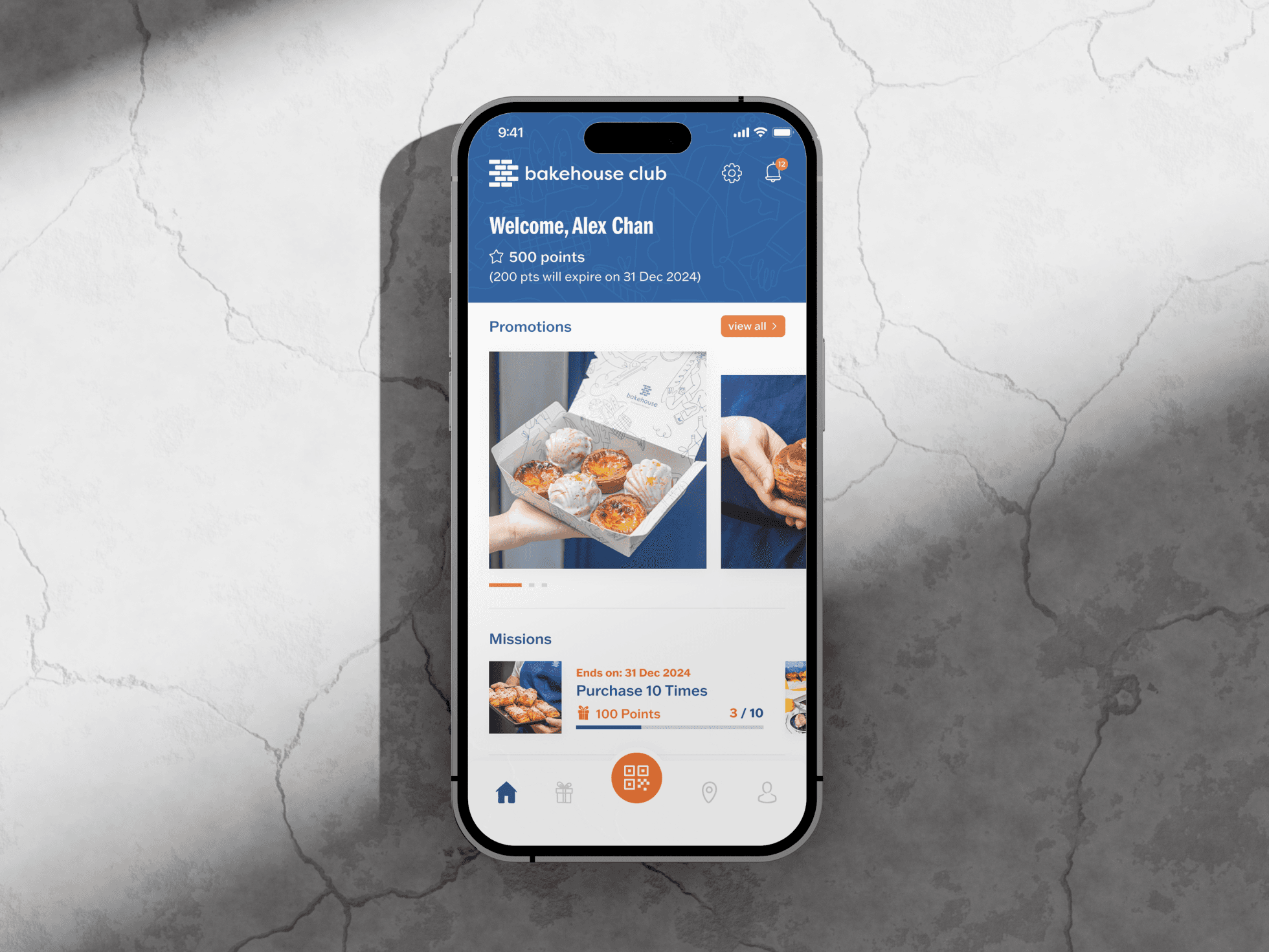
Results That Speaks
📈 Adoption: Tool now serves 150+ businesses (including Venchi, Facesss) and manages 300K+ members.
🎨 Feedback: Positive internal feedback on visual appeal and ease of use.
⚡ Efficiency: Design system enabled devs to build MVP features 2x faster for testing.
The Challenge: An Intimidating Internal Tool
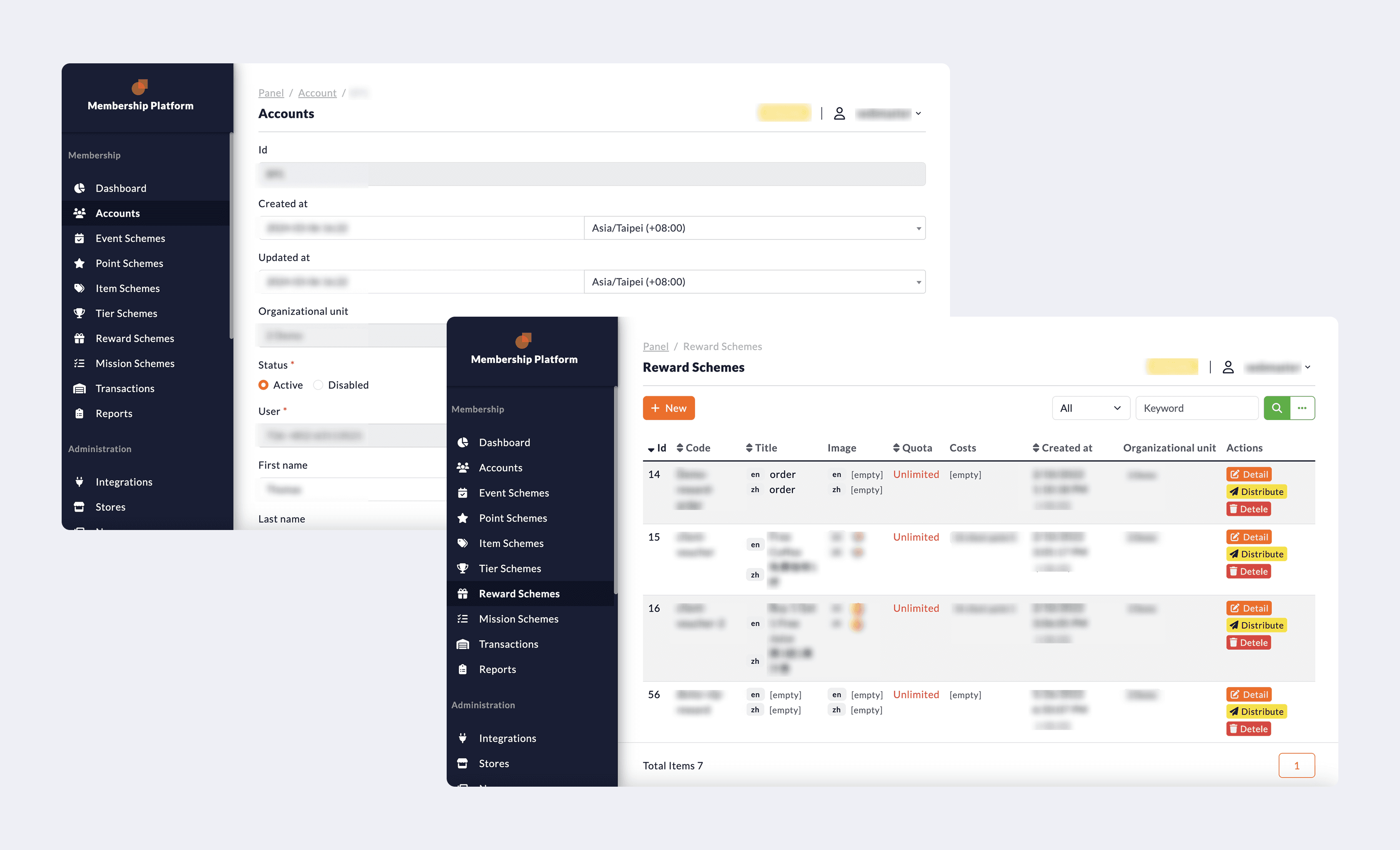
In 2021, the tool was functional but developer-oriented—dull, text-heavy, and complex. F&B owners and marketers dreaded opening it, so they underutilized powerful loyalty features.
My Goal is to redesign it to be visually inviting and intuitively navigable, so users feel confident exploring campaigns, segmentation, and member data—not overwhelmed.
My Role & Scope
As the lead product designer, I owned:
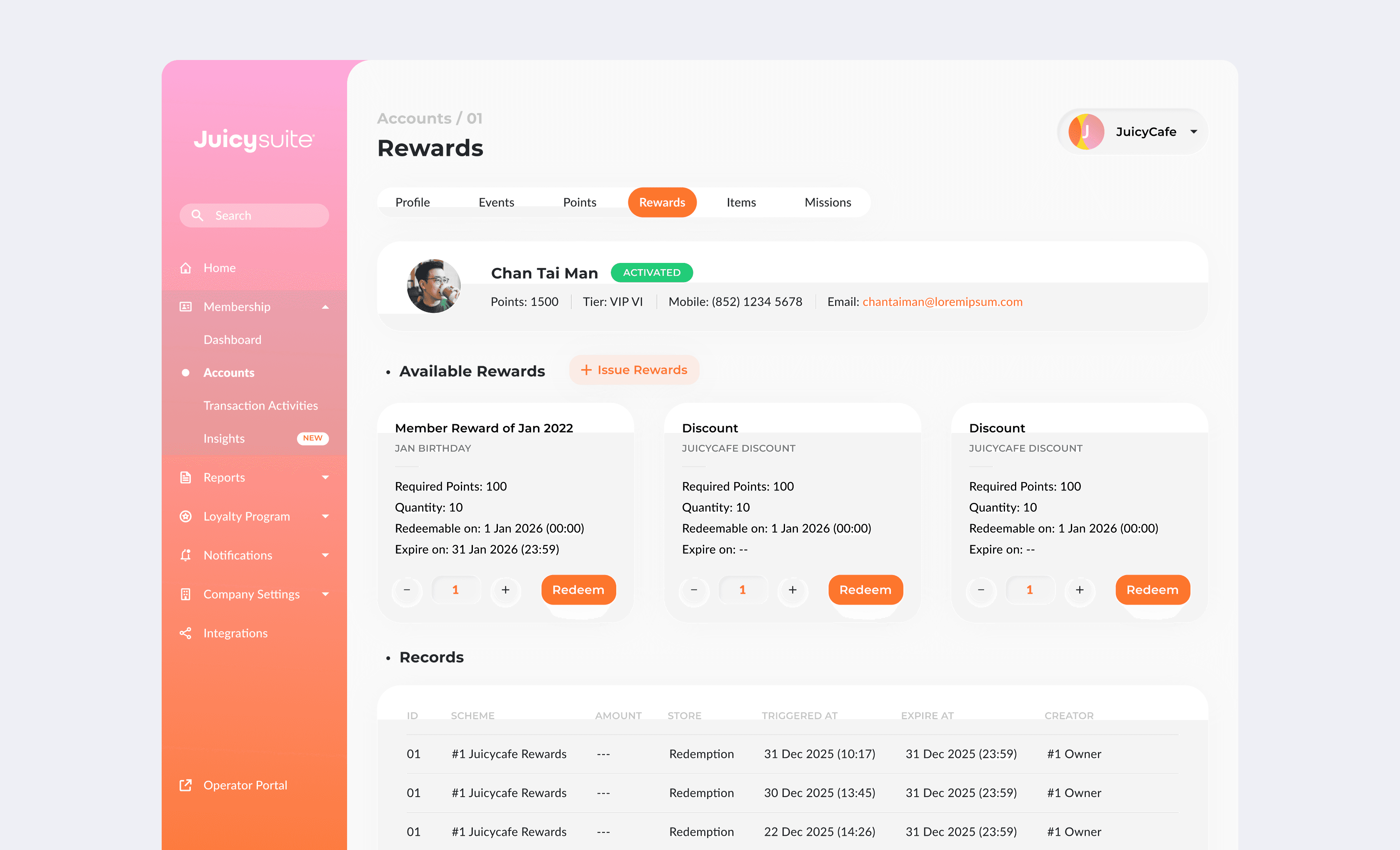
Full visual redesign—applying new brand identity to make data-heavy pages feel warm and approachable
UX strategy and information architecture for new analytics, segmentation, and notification features
Design system architecture and component library for scalability and faster MVP testing
End-to-end feature design—from discovery to high-fidelity UI and developer handoff
UX prioritization—balancing ideal experiences against legacy code and loyalty engine constraints
Design Strategy: Inviting Users Back to the Tool
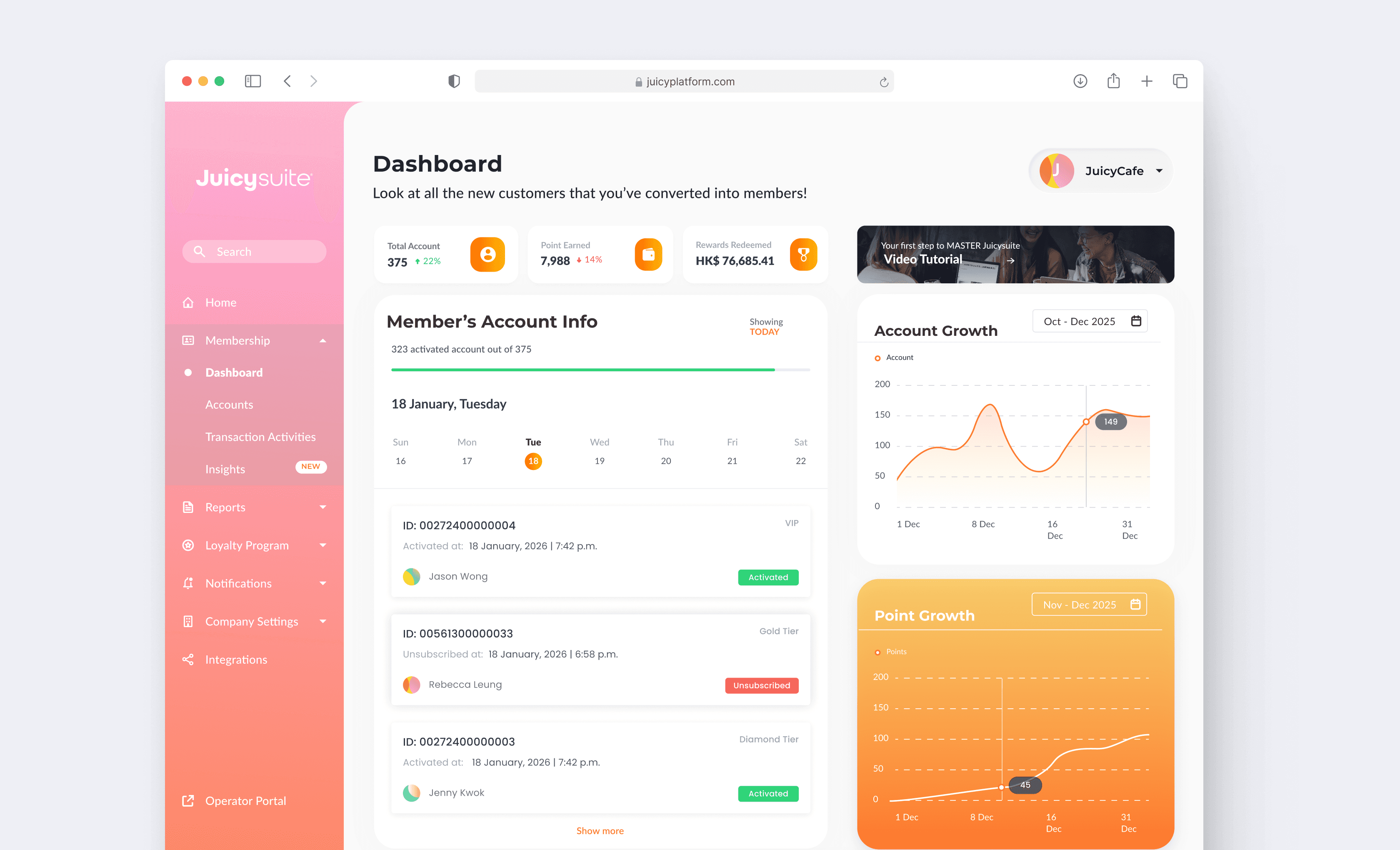
Visual Overhaul: From Dull to Inviting
I started by auditing the existing interface and mapping out every screen against the new brand guidelines. I then redesigned the entire UI with warm colors, clear visual hierarchy, and data visualizations that replaced intimidating tables with digestible cards. The result was a platform that felt approachable—encouraging users to explore rather than dread opening it.

Design System: Enabling Speed & Consistency
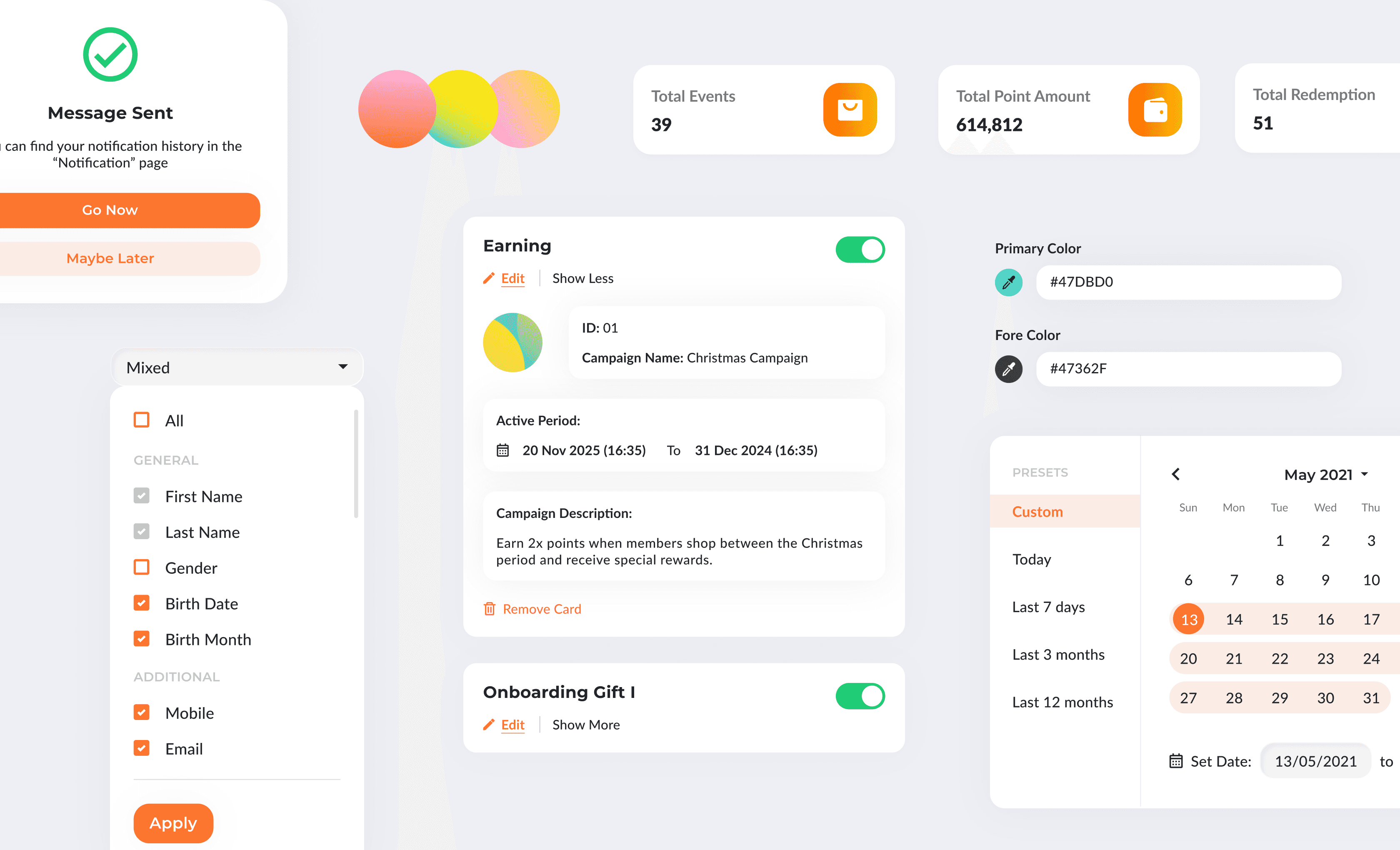
I built a scalable component library in Figma with reusable patterns for buttons, forms, tables, and data visualizations. This allowed developers to spin up MVP features quickly without waiting for full design handoffs—critical for a fast-paced product with constant feature requests.
3. New Features: Empowering Smarter Loyalty Management
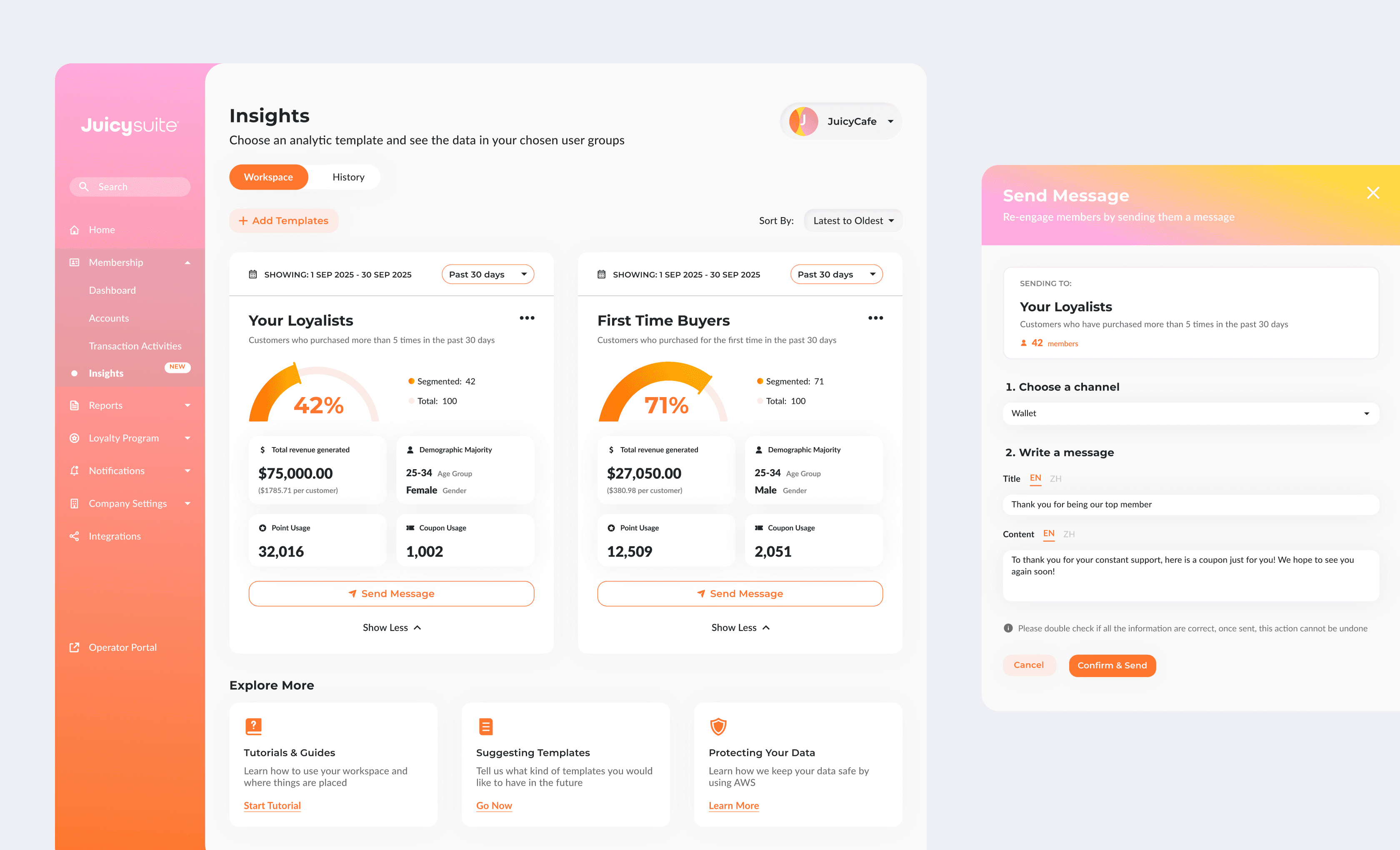
I designed a new segmentation builder for targeting specific member types (loyalists, inactive users), and gain insights in member behaviors. Each feature was crafted to translate complex loyalty logic into simple, intuitive workflows that business owners could navigate with confidence.
Key Learnings: Navigating Legacy Code
Great design isn't just about beautiful UI—it's about knowing when to push and when to compromise.
Prioritize what moves the needle – Not every UX improvement could ship due to legacy code constraints. I learned to identify high-impact changes that could launch quickly while documenting bigger ideas for future iterations.
Long-term projects require patience – Over 4+ years, the product evolved constantly. I learned to embrace iteration, stay flexible, and keep advocating for users even when technical trade-offs were unavoidable.