Tap & Go: Redesigning The Digital Red Packet Experience For Chinese New Year
Tap & Go
Shipped in 2023
TEAM
Jeannie Tse
UX/UI Designer
VIncent Chan
UX Design lead
Veona Lau
Project Manager
Ken Ng
Developer
Thomas Cheng
Developer
TOOLS
Figma
Rive
Lottie
After Effect
TIMELINE
Oct 2022 - Jan 2023
3 months
PLATFORMS
IOS app
Android app
Web browsers
📋 OVERVIEW
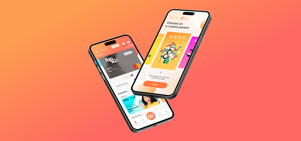
What is Tap & Go?
Tap & Go is a mobile wallet that incorporate both Mastercard® and UnionPay card schemes to support payments online and around the globe.
Recognizing the significance of Chinese New Year, Tap & Go incorporated a digital red packet feature, enabling users to share festive blessings and red packets with friends and family.
As the UX/UI Designer, I:
-
Led the redesign of the red packet journey
-
Created various Chinese New Year illustrations.
-
Animated key elements and red packet interactions.
-
Maintained close communication with Tap & Go teams, design lead, project managers, and developers to ensure seamless technical integration.
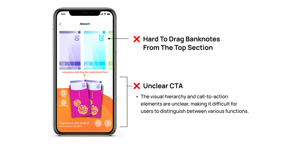
⚠️ PROBLEMS
Why did Tap & Go want a redesign?
The red packet journey had remained unchanged for several years. After talking with the Tap & Go team, gathering their user feedback and analyzing the current user flow, I identified the following issues:

📍 GOALS
Creating an intuitive & fun experience
Tap & Go has recently undergone a homepage revamp, due to this, they sought to harmonize the red packet feature's design elements with the refreshed brand aesthetic. However, they also desired to retain a distinct celebratory look for the Chinese New Year period, ensuring the feature stood out while maintaining overall brand consistency.
01
02
Align design with the new brand aesthetic to maintain consistency while retaining a distinct celebratory feel.
FEATURE 01 - UX DESIGN
How might we help users create and send their red packets more smoothly?
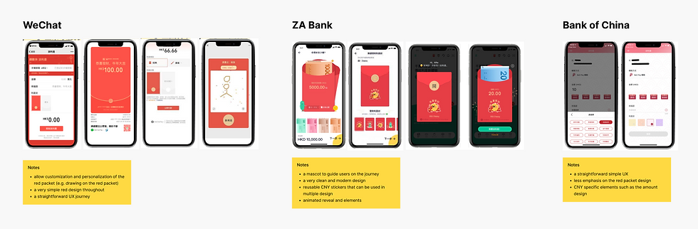
/ Referencing Competitors
Before beginning the design stage, I started researching other banks like Citiban, BOC, Hang Seng Bank etc. on how they craft their red packet flows and the functions they included.
Most of them opted for a streamlined, single-page implementation, while others used a multi-step, journey-oriented design that guides users through a personalized red packet customization process.
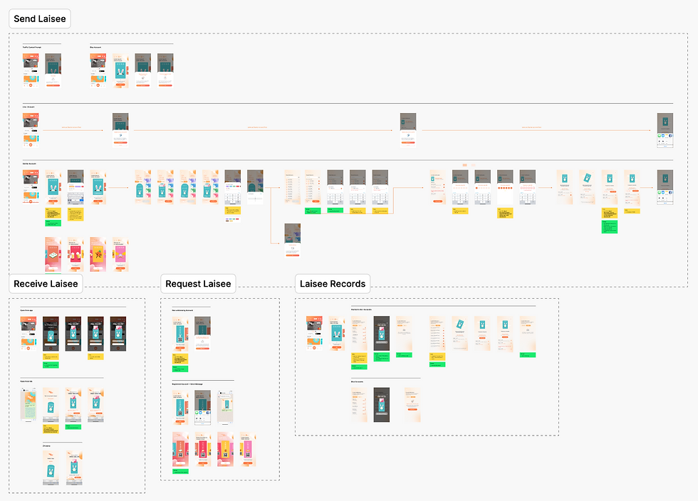
/ Mapping Out Journeys
Building upon the insights gained from the competitive analysis, I began creating wireframes and user journey maps. This involved a thorough exploration of all potential use cases, tailored to the specific account tiers and access permissions of our users.
To guarantee that the design effectively translated into a functional product, I maintained close communication with the technical team. These collaborative sessions allowed me to clarify any technical constraints and ensure that the design logic and user flows were aligned with the system's capabilities.

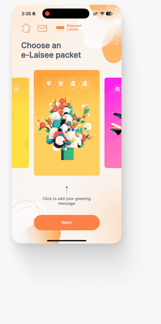
/ Solution
01 - Clear Visual Hierarchy
Through various iterations, I implemented new illustrations and aligned color palettes with the refreshed brand aesthetic. This approach established a clear visual hierarchy, effectively directing user attention to critical call-to-actions while simultaneously providing a visually engaging platform for exploring the diverse red packet designs.

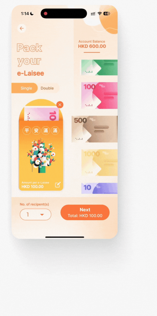
02 - Take Advantage of Common Mobile Touch Behavior
By implementing a banknote selection system that mirrors the common scrolling action users employ daily, I enabled effortless vertical navigation and direct drag-and-drop into the red packet. This strategic design change replaced the previous top-oriented approach, resulting in a significantly faster and more intuitive selection process.

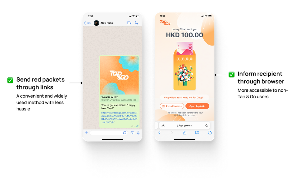
03 - Send Red Packets To Anyone
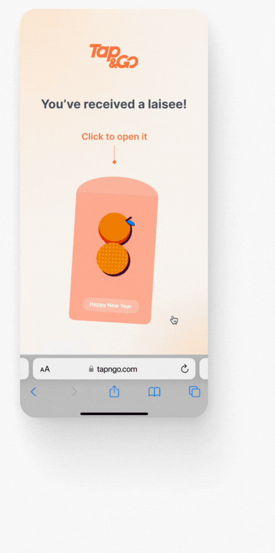
To broaden accessibility and ensure a frictionless user experience, we extended the red packet functionality to include recipients who do not have existing Tap & Go accounts. Recipients would then receive a notification and access their red packets through a dedicated, secure web browser, effectively removing the need for immediate app adoption and ensuring a seamless experience for all parties involved.
FEATURE 02 - UI DESIGN
How might we design the app to amplify the feeling of celebration?
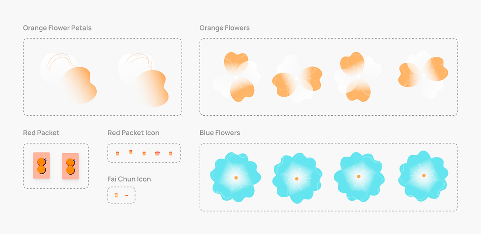
/ Adding Chinese New Year Elements
We aimed to cultivate an energetic and celebratory atmosphere within the app, inspiring users to actively participate in the tradition of sending red packets. To this end, I designed a variety of Chinese New Year-themed illustrations to amplify the festive spirit and make the red packet feature a memorable experience.
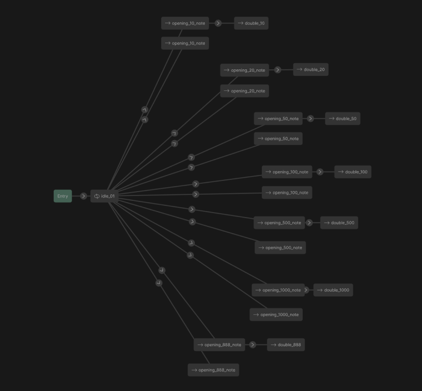
/ Using Rive To Add Motion & States
To enhance user engagement and provide dynamic feedback, I utilized Rive to animate the Chinese New Year elements.
Employing state machines, I created interactive animations that visually represented the various stages of sending red packets, using motion as a form of positive reinforcement.
I also worked closely with developers to dynamically adjust the visual representation of the red packet and banknotes based on the user's input amount, creating a responsive and personalized experience.
/ Final Designs
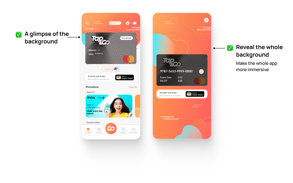
01 - A Festive Home Page
We integrated Chinese New Year decorative elements into multiple backgrounds to enhance the app's immersive and festive atmosphere.
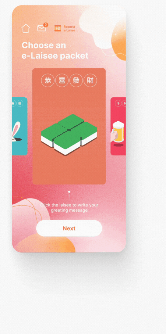
02 - A Unqiue & Dynamic Look
To create a distinct and celebratory look for the red packet feature, aligning with our project goals, I used the signature red and pink colors and added subtly animated elements against a light backdrop. This ensured the red packet designs remained the focal point for users.

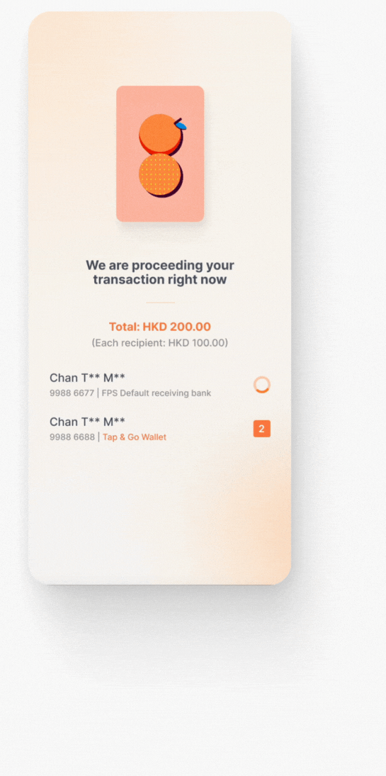
03 - Animated Feedbacks
To effectively communicate the progress of the red packet sending process, I created stage-specific animations. Motion was used to provide positive visual feedback to users, while also generating a sense of excitement and anticipation for the recipients.

BEFORE & AFTER
A Complete Makeover

HANDOFF
Preparing Designs For Tech Team
/ Design Documentation
To promote project transparency and facilitate efficient cross-team collaboration, I comprehensively documented all design modifications, user flows, and key decision changes. This documentation was organized by account type, explicitly noting distinct technical requirements. I also ensured precise communication with developers, supplying detailed design specifications and animation assets to guarantee accurate technical execution.
LEARNINGS
What I learned
/ Challenges
A key challenge of this project was to strategically balance the modernization of a deeply rooted cultural tradition. This required a deliberate design strategy that respected the cultural significance of the red packet while incorporating modern UI/UX principles. I have to:
-
Find the right balance between tradition and modernity.
-
Implement complex animations and dynamic visual changes within the constraints of mobile platforms.
-
Present design concepts to various stakeholders in different stages.
/ Learnings
Despite the project's complexities, I found it incredibly rewarding to be able to suggest different creative solutions for such a high-profile initiative. I'm deeply appreciative of my team's support throughout the process. I gained a couple valuable insights on how to craft immersive and festive experiences:
-
Research and draw inspiration from real-world events or actions.
-
Develop a compelling narrative or storytelling to guide design execution.
-
Understand technical constraints early on to ensure efficient implementation.
👋 Check out my other projects

Sanrio
Shipped in 2025


B2C Solution Onboarding Optimization
Juicysuite
Conducted in 2024