Wallet Pass: Optimizing Juicysuite B2C Solution's Onboarding Experience
Juicysuite
Shipped in 2024
TEAM
Jeannie Tse
Product Designer
Vincent Chan
Product Manager
Chris Cheng
Head of Growth
Yellow Chan
Business Executive
Him Fan
Developer
TOOLS
Figma
TIMELINE
Mar 2024 - May 2024
2 months
PLATFORMS
Mobile web browsers
📋 OVERVIEW
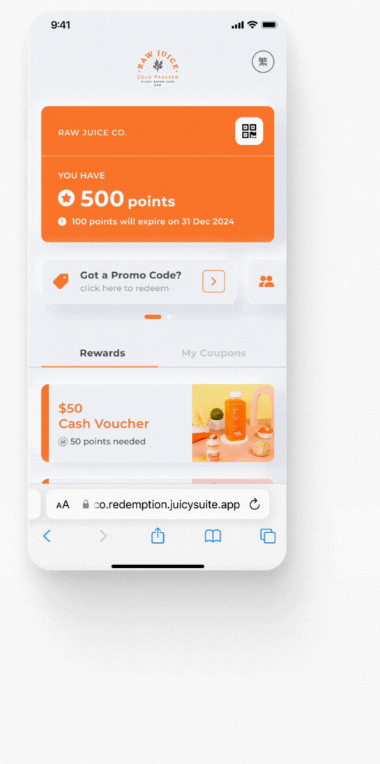
What is a Juicysuite Wallet Pass?
Juicysuite's Wallet Pass is a powerful B2C solution for small businesses, designed to simplify customer-to-member conversion.
Forget bulky physical cards and cumbersome app downloads. With Wallet Pass, customers can effortlessly sign up for membership through their mobile browser and instantly add a secure digital membership card to their Apple or Google Wallet. They gain access to the member center with points tracking, reward redemption, and exclusive offers.
As the Product Designer, I:
-
Led the redesign of the Wallet Pass's card addition and member center.
-
Mapped out journeys and cases.
-
Communicated closely with growth team, product manager and developer on requirements, timeline and tech feasibility.

🔥 IMPACT
Soooooo,
What did we achieve?
66.67%
Decrease in client support requests
>160K
members benefited
By resolving key pain points, this feature's introduction has directly benefitted over 160,000 members. We've observed a significant 66.67% reduction in client support requests, demonstrating the feature's effectiveness in empowering users to self-serve and navigate the product with greater ease.
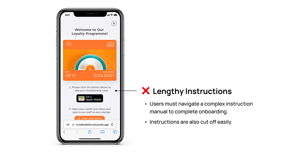
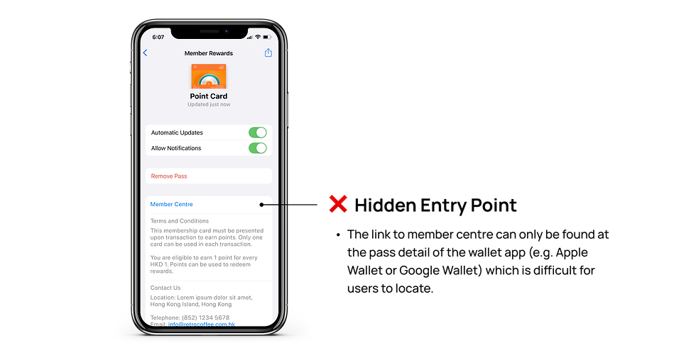
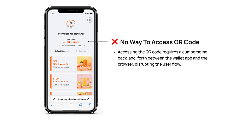
⚠️ PROBLEMS
A rudimentary design that frustrates users
The existing design, a relic of past iterations, has not undergone any updates in recent years.Through discussions with users and a thorough review of customer support tickets, I uncovered a series of critical issues that significantly impede user experience and satisfaction.
📍 GOALS
A seamless onboarding experience
With Wallet Pass already supporting a user base exceeding 100,000 members, it became critically important to elevate the design. Our objective was to not only enhance the user experience for our existing community but also to ensure the platform could effectively scale to accommodate future growth and maintain user satisfaction.
Therefore, it was essential that we redesign the layout in order to:
01
Create an intuitive and frictionless onboarding experience that encourages first-time user participation.
02
Enrich the visual design to create a more engaging interface, and ensure that all functionalities are easily accessible.
ALIGNMENT
Understanding the technical limitations
Prior to initiating the redesign process, I sought to understand the root cause of the design's stagnation. To gain clarity, I talked with team members, which revealed some technical constraints.
/ Timeline & Trackers
-
Our system lacked the capability to verify whether users successfully added cards to their digital wallets, limiting the scope of potential design solutions.
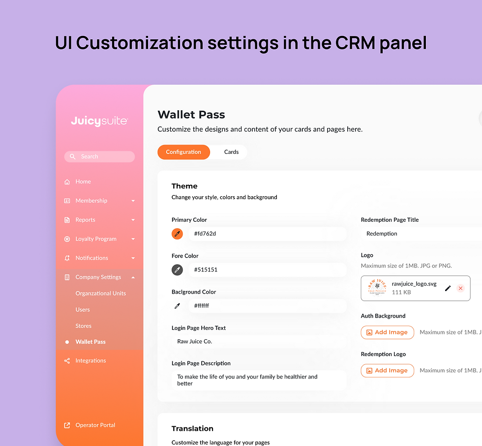
-
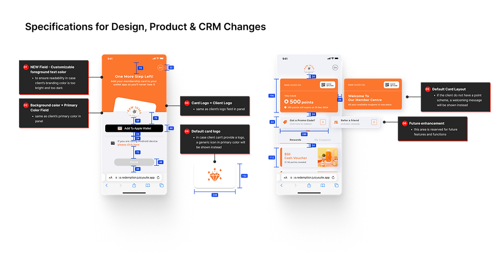
Significant layout alterations have the potential to ripple across the entire CRM panel, impacting all customization options in it. It is crucial to consider which elements are customizable by business owners before designing.
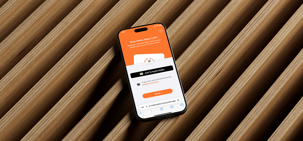
FEATURE 01 - ADD CARD TO WALLET
How might we guide users to quickly add the card to their digital wallet?
/ Emotionally-Driven Ideas
During our brainstorming sessions, we explored a variety of creative concepts, with a particular emphasis on the emotional aspect. We moved beyond a purely functional approach, and infuse the add card process with a sense of invitation. By framing it as an exclusive opportunity rather than a mere task, we aimed to subtly persuade users to seamlessly integrate their cards.
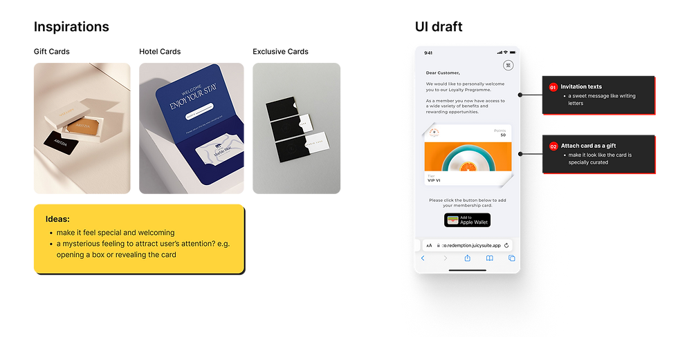
/ Solution
01 - Visual Metaphor
To create a more intuitive and engaging experience, I implemented a card-adding animation that mirrors the physical act of placing a card into a wallet. This subtle visual cue was designed to gently guide and encourage users to add their cards into the digital wallets.
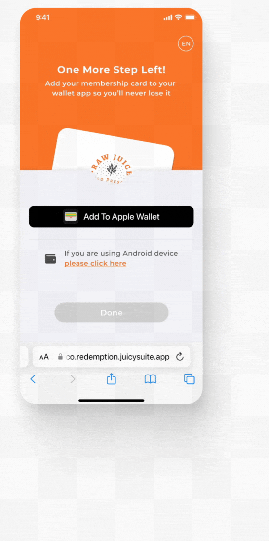

02 - One Action At A Time
I simplified the flow by displaying only one call-to-action at a time. Once the 'Add to Wallet' button was clicked, the 'Done' button would activate, granting users immediate access to the member center.
To accommodate users who might opt out of card addition or with slow internet connection, we also implemented a five-seconds delay. If the card was not added within this timeframe, the 'Done' button would activate regardless.
_gif.gif)

FEATURE 02 - MEMBER CENTRE
How might we encourage users to interact with the member centre?

/ Referencing Competitors
I performed a competitive analysis of prominent products, including Eber and Mobile Card, to assess their feature sets and design implementations.
The analysis revealed a functional deficit in our product, specifically a lack of key loyalty features like referral programs and promotional codes.
Furthermore, a common design pattern observed was the utilization of a top card layout for displaying essential information.
/ Solution
01 - Enriching Layout & Functions
I redesigned the interface using a card-like structure, ensuring key information was readily accessible and visually prominent. I also took this opportunity to illustrate how additional loyalty features, like promo codes and referrals, could be seamlessly integrated into the layout for future product growth.
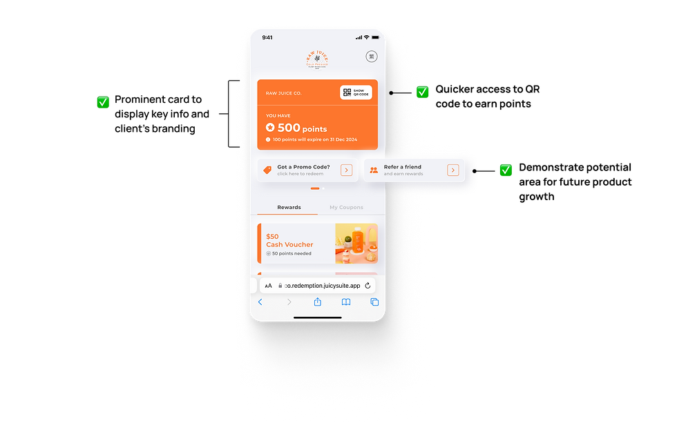
02 - Guiding Users By Subtle Motion
To guide users towards key functionalities, I incorporated subtle motion cues to gently draw attention, such as the QR code access point and the display of newly added wallet coupons. This ensures users could easily locate and utilize key elements without feeling overwhelmed.


Usability Testing
Putting the new design to the test
To validate the usability and effectiveness of our new design, I set up a quick usability test among 5 young individuals with no prior experience using our product but are familiar with other loyalty programs. The results were positive, with:
-
the average onboarding time (including registration and adding a card) being just 1 minute and 9.8 seconds.
-
all participants successfully located the member centre independently.
-
all participants also successfully located the QR code within the member centre independently.
-
all participants preferred the new design over the old one, citing that it looks cleaner and clearer.
BEFORE & AFTER
The Transformation

HANDOFF
Preparing Designs For Product Team & Tech Team
/ Design Documentation
To maintain product alignment and facilitate effective cross-team collaboration, I documented all design modifications, user flows, and key decision points. This documentation is particularly critical for changes that may impact the CRM panel, ensuring its continued feasibility for clients to customize their UI layouts. By comprehensively recording these changes, we can proactively carry out potential enhancements and ensure seamless integration with the CRM panel.

LEARNINGS
What I learned
/ Challenges
This project offered a unique challenge: building upon the foundational designs created by previous designers while simultaneously addressing evolving business, technical, and user needs. In particular, I needed to:
-
Balance business objectives, design principles, and technical feasibility.
-
Navigate design challenges imposed by existing work and technical limitations.
-
Understand the complex interrelationships within Juicysuite B2C and B2B product ecosystem.
-
Communicate with various stakeholders for the optimal solution.
/ Learnings
Through this project, I developed a deeper understanding of how to approach a complex product ecosystem:
-
Bridge the communication gap with developers through technical understanding. Lots of discussion is expected.
-
Leverage collaborative brainstorming to uncover diverse perspectives and creative solutions.
-
Narrow the scope and tackle different problems one by one.
-
Design for scalability to accommodate future growth and evolving needs.
👋 Check out my other projects

Sanrio
Shipped in 2025


Mobile Wallet Red Packet Campaign
Tap & Go
Shipped in 2023